 SEO & Accessibility
 AI
AI Localization
 Ecommerce
 Forms
Forms Fields
 Development
 Security
 Templating
 Performance
 Control Panel
 Widgets
 Assets
 Utilities
 Mailer Adapters
 Social Networking
 Integrations
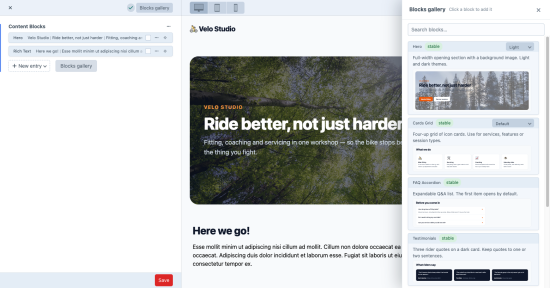
Editors can't tell which Matrix block is which. With 20, 30, 40 block types, the "New entry" menu is a list of names — Cards Grid, Feature Split, Promo Strip — and the only way to find out what one looks like is to add it and look. Component Guide replaces the guessing with a visual Matrix block picker: real previews of every block a field accepts, rendered live from your own Twig templates.
For editors
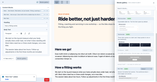
- A visual block picker on every Matrix field. A "Blocks gallery" button opens previews with descriptions, grouped and searchable — in the entry editor and in Live Preview, in blocks, cards and index view modes.
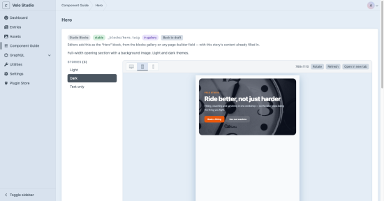
- Pick the variant, not just the block. Light or dark, image left or right — each variant is its own card.
- One click adds it, prefilled (Pro). In inline-editable fields the block lands with the variant's content — text, dropdowns, lightswitches, radio buttons — so it's on the page straight away. Wrong one? Undo.
For developers
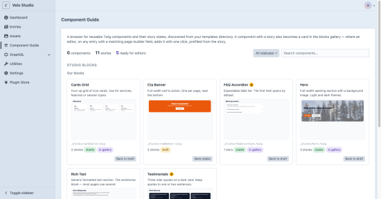
- A component library in the control panel. Every Twig component in a folder, with live previews at desktop, tablet and phone widths and your site's own CSS. No Storybook, no separate build.
- Previews that can't go stale. They're rendered from the actual template, not uploaded screenshots — change the template and the preview changes with it.
- Stories are plain files next to the template, versioned in git. One click scaffolds a first draft from the template's variables, and a coding agent can document a whole library in one pass.
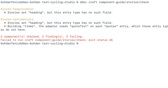
- Catches previews that lie. A contract check flags a story that sets a field the entry type doesn't have — in the control panel, and as a CI step (Pro).
Lite and Pro
Lite is free, in production too: the component library, live previews, the contract check, and the blocks gallery editors browse. Pro — $99 per site, then $39/year for updates after the first year, free in development and staging — adds the click that inserts a prefilled block, Undo, and the CI check.
Worth knowing
- Each block type needs its own template file. Markup kept inside one big if/else template isn't picked up until it's split out.
- Components that query Craft themselves need a story that passes plain values; presentational partials work as-is.
- Previews are as accurate as the CSS you point them at.
- Matrix fields only (not Neo).
Requirements: Craft CMS 5, PHP 8.2+ · Tested on Craft Cloud
Lite
Pro
Plus $39/year after one year.
To install this plugin, copy the command above to your terminal.